This section highlights accessibility considerations specific to front-end development. Code snippets have been added where relevant as examples.
Warning - Try not to get lost in the weeds. There may be more than one “right” way to do something. The goal is to make things incrementally better for the widest audience possible.
Information conveyed by an image should have a text alternative in case the image cannot be viewed. This is a basic concept, but there is an art to writing appropriately descriptive text to replace an image.
How to do it
Informative Images: Contains information that is not represented elsewhere. Note this typically isn't a literal description of the image.
<p>
  <img src="images/dog.jpg" alt="Dog with a bell attached to its collar.">
  Off-duty guide dogs often wear a bell. Its ring helps the blind owner keep track of the dog’s location.
</p>
Decorative Images: Images used as spacers, icons, purely decorative, and CAPTCHA images, or other situations where the alt attribute would be redundant with the other page content.
<p>
  <img src="sleepingdog.jpg" alt="" role="presentation">
  Let sleeping dogs lie: Let sleeping dogs lie is a proverb that means “don’t initiate trouble. If something that could be troublesome is quiet, then leave it alone”.
</p>
Functional Images: Images used as buttons or other interactive elements.
<a href="javascript:print()">
  <img src="print.png" alt="Print this page">
</a>
Addtional situations where alt attributes should be used:
Images of text.
Complex images (such as charts).
Groups of images that collectively have one meaning (such as star ratings).
How should radio buttons or groups of checkboxes be labeled?
For consistency, labels should be associated with a for attribute like other form elements. Wrapping the label around the input works, but is less flexible. Note that a fieldset and legend should be used on all but the simplest sets of checkboxes or radio buttons.
Important Headings, lists, and special text are used appropriately.
Headings and other tags provide information about what content is available, and which piece is most important on the page. This information allows people using assistive technologies to “see” an overview of the page and jump quickly to the section that is relevant to them.
How to do it
Make sure the page title is an <h1>, and that it is the only <h1> on the page.
Use heading tags to create an outline structure for the main content on the page.
<h1>Outline structure based on heading tags...</h1>
  <h2>...</h2>
    <h3>...</h3>
      <h4>...</h4>
      <h4>...</h4>
      <h4>...</h4>
  <h2>...</h2>
    <h3>...</h3>
      <h4>...</h4>
    <h3>...</h3>
    <h3>...</h3>
How do you adjust heading styles for presentation without breaking heading order?
One cleanish way to switch the visual style of a heading without breaking the heading order is to use a heading class that mirrors the styles on the native headings. Something like h2, .h2 { styles... } This can allow sidebars and other blocks to look right while avoiding too much extra CSS.
Use lists or special text to help describe the type of content being presented. For example: <strong> semantically means important, while <b> just means visually bold, not necessarily more important.
Caution: Tables in a rich text editor
TinyMCE and CKEditor are the most common editors in the CMS we use. Both are limited in what kind of table an editor can reasonably create.
Here are some features and limitations to be aware of.
Feature
TinyMCE 4
CKEditor 4
Wrap table in div with a class
No
No
Add a class on the table tag
Yes*
No
Can add headings
Yes
Yes
Can add a caption
Yes
Yes
Can add thead or tfooter
No
No
Can set percent-based widths
Yes
Yes
Can force percent-based widths
Yes*
No
Can suppress styling options
Yes*
No
Prestyled tables
Yes**
No
* This requires adding the tables plugin to TinyMCE.
** TinyMCE has the concept of a template that drops in predefined HTML. This could offer a way to start editors off with a good base table.
Important The page order is clear and makes sense.
Maintaining a logical order of elements on the page, both visually and in the source code avoids confusion for all users.
How to do it
Separate navigation, content, and other supplemental sections of the page into distinct blocks. HTML5 tags and ARIA roles can help communicate this structure.
Currently ARIA landmark roles are still used in addition to HTML5 tags for better support across browsers and other assistive technologies. This can be seen in the previous code example.
Avoid shuffling the visual order of elements unnecessarily with CSS. This is especially important for navigational links and form elements. Flexbox and CSS grid can easily shuffle elements visually leaving the focus order chaotic.
Pro Tip - Try turning off all CSS and see if the flow of the page still makes sense.
What is the difference between an <article> and a <section>?
A <section> is part of a larger “thing”, and is likely to have siblings that are similar in concept, like chapters in a book. An <article> is a complete thing on its own. So, this could be something like a blog post or a poem. Both sections and articles can be nested inside eachother.
Avoid relying solely on things like shape, sound, position and size to identify page elements in instructions.
How to do it
Don’t use sound alerts in general. But if you do, also include a text indicator of what is going on.
Make instructions detailed but clear, considering that elements may move depending on the device, or may be interacted with without visual feedback.
Tables often rely on visual relationships between cells to make the data understandable. To maintain these relationships for assistive technologies, the correct markup must be in place. More information can be found in this tables tutorial.
Accessible Tables
Tables make sense for tablular content. But giant tables of data simply don't fit on small screens. How can you provide a usable experience for people, and maintain accessibility?
Start with a well structured table. Define column and row headings. Use a caption to identify the table, similar to a title or heading. For more complicated table structures, use the scope attribute to associate column and row headings with the correct data. Solid markup is your friend. Then get fancy as needed. Some responsive layout options include:
Horizontal scrolling: Bootstrap includes the option to wrap a table in a div with the "responsive-table" class. This keeps a wide table from breaking the page layout, giving a horizontal scrollbar on the table instead.
Table stacking: Reassign CSS display properties to table elements to create a single column view of the data on small screens without duplicate markup, or complicated javascript. Here is a table stacking demo.
Reordering content with JS: A more invasive approach would be to toggle columns, or shuffle content as desired with a javascript solution like tablesaw.js. This approach is the most powerful, but really only works with a controlled table structure. No site editor can touch this.
Table Alternatives
Don't use tables for layout purposes. We aren't savages here. If you're tempted, here are some alternative ways to put things beside eachother:
Description lists: If you have a two column table. You may really want a description list (formerly a definition list).
Just float it: You want an image next to some text? Just float it, and use a class to make the spacing look nice.
Bootstrap columns: If you're using Bootstrap already, this is an easy win for simple content, and reflows responsively.
Flexbox: For structural layout of things in a row, flexbox can mimic many of a table's attributes, but also can reflow responvively.
CSS Grid: For two-dimensional alignment of elements on the screen, CSS Grid is what you want. Just don't go wild shuffling the order of elements, or risk confusing people who rely on the tab order.
1.4 Text size, links, and color contrast
Critical Audio that plays automatically has controls to play, pause, mute, or adjust volume.
How to do it
The best practice is to avoid audio that plays automatically in the first place. But if you have to, give users control of that audio, so it isn’t competing with screen readers, or generally annoying everyone.
Note that short audio alerts less than three seconds are excluded from this rule.
Level AA Page is readable and functional when the text size is doubled.
Accommodate mild vision impairments by allowing text to scale without breaking the layout or functionality of the site.
How to do it
Using em-based font sizes across the site allows for easy proportional resizing of the text without having to adjust many separate elements individually. In Bootstrap the base font size is set on the body. If you set the headings, paragraph, etc. tags to use ems, you can control the font size proportionally site-wide by adjusting the pixel value on the body element itself.
In general, a fluid responsive layout responds well to variable text size with little adaptation.
Areas to watch
Elements with limited heights or widths. Horizontal navigation, image carousels with overlayed text may need some extra attention to expand gracefully.
Similarly. Elements with heights set in javascript may need a manual reset when scaled up.
Very large heading text may become so large that individual words don't fit within the width of the page and end up clipped. In these cases, these headings may be able to be excluded from scaling beyond a reasonable point.
Fixed position elements can fill the available space and obscure the page content when scaled up, so use with caution.
Note - This guideline has been previously interpreted to mean that font resizing controls need to be provided in addition to the browser’s built in scaling capabilities. That doesn’t seem to be necessary according to this interpretation of the text-sizing requirement, unless scaling the page with the browser does result in clipped text or unusable controls.
Level AA Real text is used vs. relying on images of text.
How to do it
Text should be text, so it works like text. Some exceptions are logos, or text in an image that is decorative rather than meant to be read. But generally speaking, just use real text.
A background color should always be set, even when it won't show under normal circumstances. Missing and disabled background images reveal the background color. Many times this is a failing variable in accessibility tests.
Fail Example
Typical View
Example Heading
Images Disabled
Example Heading
Pass Example
Typical View
Example Heading
Images Disabled
Example Heading
Gradient Background
Background gradients can cause accessibility tests to fail when the contrast is actually compliant. To pass, add a solid background color to the end of the gradient in the CSS.
Critical All page functionality is available using the keyboard.
How to do it
Navigation with tab, ←↑→↓, return, and spacebar are the most common methods of browsing with a keyboard. Although this is fairly basic, testing can uncover unexpected glitches or highlight pain points with the controls, page structure, etc.
Note - Different browsers focus on a different set of elements by default. Typically this can be adjusted in the browser preferences under the accessibility options. Safari is the exception. It uses a keyboard setting on the OS level (System Preferences > Keyboard > Shortcuts > Set full keyboard access to “All controls”). The hotkey to toggle this setting is control+F7.
How do you make drop down menus keyboard accessible?
Consider the following:
Avoid using menu labels to both open the menu AND link to a page.
Keep visually hidden items out of the tab order until shown. This keeps the page focus from getting lost.
Close a menu when selecting an in-page link item.
Use aria-expanded to communicate that a menu is open or closed.
How do you make off-canvas menus keyboard accessible?
Off-canvas functionality is just a specialized type of expandable content so, the accessibility adaptations are the same:
Use a button to toggle the menu open and closed (rather than an a) since it is a control not a link.
Adjust the aria-expanded state on the button to keep it in sync with the state of the menu. This enables the screen reader to announce whether the menu is expanded or collapsed.
Make sure the menu is actually hidden from screen readers and the tab index when closed to avoid confusion.
Keep the content of the off-canvas directly after the button that expands it in the source order. This makes it easily findable. If this isn’t possible, you will have to manage the page focus manually in javascript using $(this).focus(); and adding tabindex='-1' on the off-canvas content wrapper.
Here is a javascript snippet showing how to manage the aria-expanded state:
var    toggleBtn = '.btn-off-canvas-toggle',
       navWrap = '.l-header__nav';

// toggle off-canvas
$(toggleBtn).on('click', function() {

    if ($(toggleBtn).attr('aria-expanded') == 'false') { // off-canvas is collapsed

        // syncing aria-expanded attribute on the menu button
        $(toggleBtn).attr('aria-expanded', 'true');
        // reveal hidden nav
        $(navWrap).css('display', 'block');

    }
    else { // off-canvas is expanded

        // syncing aria-expanded attribute on the menu button
        $(toggleBtn).attr('aria-expanded', 'false');
        // hide nav from screen readers and tab focus
        $(navWrap).css('display', 'none');

    }
});
Note - The variables above line up with Marshall’s off-canvas plugin, but this (obviously) doesn’t show the complete off-canvas code.
Here are some more examples of using aria-expanded on the W3C. Note that collapse.js in Bootstrap uses aria-expanded out of the box.
An accessible date-picker.
Selecting a date or date range is a deceptively complicated interaction that isn't directly covered by a native input. So how do we do it well?
Just use an input field
At the most basic, an input field that asks for a date would work. However, even with format validation, this puts a lot of responsibility on the user to get the format right.
Adding a type="date" to an input field gives you an automatic date picker in Chrome, Firefox, Edge, and iOS. No luck in Safari or IE. Mileage will vary in terms of accessibility. This could be a nice native approach if all the browsers get a solidly implimented solution.
Multi-step date input
You can split the date into individual month/day/year select boxes or input fields. This turns the date selection into a series of simple interactions rather than one more complicated one. It is a durable, but somewhat limited and tedious approach.
Use a date picker plugin
Creating a solid date-picker that is touch friendly, uses aria tags, and is keyboard accessible is complicated. Most available plugins were not built with these things in mind. The Pick a Date plugin is one option that provides a good starting point.
Page-specified shortcut keys do not conflict with existing browser and screen reader shortcuts.
How to do it
Avoid shortcut keys. They can seem like a good idea, but in practice make a site function differently than the rest of the web. If you need shortcut keys the underlying design may just need some tuning to be more traditionally accessible.
An exception to this is online tools that function more like an app. If the user will be returning often to do specific tasks beyond standard input functionality, hotkeys may make sense. In that case, avoid common keys for keyboard navigation including the tab, ←↑→↓, return, and spacebar keys.
Critical Keyboard focus is never locked or trapped at one page element.
The goal is to make sure there isn’t a dead end on the page that stops someone from using the site with a keyboard.
How to do it
Watch for drop down menus, popups, frames, or third-party widgets that accept focus but don’t provide a way out.
Keyboard trap exception
The possible exception to the keyboard trap rule is when this behavior is beneficial to control the scope of the page navigation. For example:
Off-canvas navigation that loops focus within the menu when open.
Within an open modal that overlays the primary content.
In these cases it would be more confusing to have the page focus shift off these content areas while they are open. Provided there is a clear method for closing these items (and freeing the page focus), this should be in compliance.
How do you ensure all content is accessible if javascript is disabled?
One way is to detect if javascript is available, and tune your site styles to make sure all content is visible and not too jumbled without JS help.
Start with a no-js class on the html tag.
<html lang="en" class="no-js">
Use a script to replace the class. If the script does NOT run, javascript is assumed unavailable.
The no-js class lets you create a fallback state where you can target things like tabs and sliders that may need adjustment. You can also hide controls for functionality that depends on JS to work. Best practice is to display hidden content by default, and visually it hide after the page loads, so hopefully there isn’t too much to do.
.no-js {
    //examples of tuning display of elements to make more sense if there is no JS
    .search-link, .text-resizer, .nav-tabs {
        display: none;
    }
    .collapse {
        display: inherit;
    }
    .tab-content > .tab-pane {
        display: inherit;
    }
}
2.2 Moving content and time limits
Carousels that rotate automatically have controls to stop and start the action.
This guideline gives people control over the speed they read content as well as a way to reduce the visual distractions on the page.
Note - This also applies to other moving, blinking, scrolling, or automatically updating content.
How to do it
Provide an option to control the frequency of an automatically updated section of content. With a carousel, this means adding a play/pause button as well as the next and previous buttons or other navigation.
Exceptions - This doesn’t apply to things that don’t start automatically. So a carousel that doesn’t rotate on it’s own is fine. Any movement that lasts less than five seconds is exempt as well.
How do you make a carousel accessible?
Carousels are a usability problem for any user. Making one decently accessible is that much more of a challenge.
No page content flashes more than 3 times per second.
It’s all fun and games until you’re the guy that made someone’s brain fritz out. Don’t be that guy.
How to do it
Avoid adding animated GIFs or other video or animation elements that flicker too fast, especially anything red. For more information, review this definition of general flash and red flash thresholds.
2.4 Navigation
Include a skip navigation link.
Provide a link to skip past repetitive content such as the main navigation to ease tab browsing of the site.
How to do it
This technique can be used carefully in a variety of cases, but jumping past the header and right to the main content of the page is the most common use.
Add an anchor link as the first element within the body that points to the main content for the page. Note that a tabindex of -1 has been put on the <main>. This helps the focus shift properly on all browsers.
<body>
<a href="#maincontent" class="skip-link">Skip to main content</a>
...
<main id="maincontent" tabindex="-1">
   <h1>Heading</h1>
   <p>This is the first paragraph</p>
Style this link to be visible only on tab focus. This lets it be useful for tab navigation and screen readers without interfering with standard browsing.
Navigation links, form elements and any other focusable pieces are in a reasonable order. Both visual and tab navigation order should make sense.
How to do it
Start with a logical source order for the HTML, and avoid unnecessary shuffling of elements with CSS.
If things NEED to change order at different responsive break points, it is probably better to actually move elements in the DOM with JS, or possibly show/hide duplicate markup rather than just visually move them with CSS. This will necessarily be a judgement call based on the specific situation.
Pro tip - Stepping through pages with tab navigation occasionally while building templates is a quick way to find unexpected order issues.
Link text and context indicates the purpose of the links.
Make links clear and easy to understand so the user knows what to expect before they click.
How to do it
Here are some ways a link can pass this test:
The text within the link is descriptive enough on it’s own.
The purpose of the link is clear from the surrounding content.
If the link is an image, the alt text of the image makes the link purpose clear.
Note - To avoid confusion, only links with the same destination should have the same description.
Level AA Multiple ways are available to find pages.
How to do it
Make sure a site has more than one of these ways to navigate.
Clear and consistent main navigation.
Site search on every page.
An HTML sitemap page (which links to every page on your website) with a link to it after the “Skip to Content” link.
A related links section.
Exceptions - Confirmation pages, and sites with very few pages may not need multiple navigation paths.
Should menus open on hover or click?
Menus have to open on click/tap. That doesn’t mean there can be no hover state, but touch devices typically can’t access hover states, and keyboard access isn’t good if a menu relies on hovering. There are three common approaches:
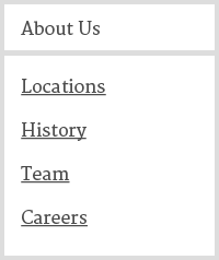
Fig 1. Labeled menu buttonLabeled menu button - A nav item that has a dropdown menu does not also link to a page. It just opens the menu when clicked. Following this structure means there are no landing pages that “contain” other pages. It is more of a folders and pages setup. This is how the Bootstrap navbar works.
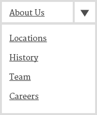
Fig 2. Link + menu buttonLink + menu button - In this approach, text links all point to pages and there are separate buttons used to open the associated menu. You get landing pages, but it can be a challenge to make the extra buttons clearly clickable. This is how Flexnav and the Marshall’s MLN menus work.
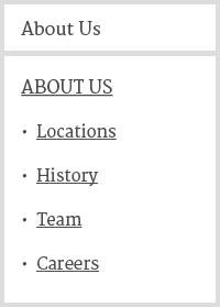
Fig 3. Button + mega menuButton + mega menu - This approach is kind of a hybrid of the first two. Menu items with dropdowns open the menu like Fig. 1, but in this case the menu itself is more elaborate than a simple list of links. There can be landing pages with nested pages as well as other featured content.
This is an architectural choice that should be considered in the strategy phase. Make sure what is being built lines up with the intended site map. More information about menus can be found in the keyboard access section.
ImportantLevel AA It is visually apparent which element has keyboard focus.
Mostly this means the focus outline hasn’t been squashed in CSS, and hidden elements don’t get focus. However, it is possible to enhance the look of the focus style to be more obvious and look nice with the overall site design.
How to do it
Outside of any element specific styles, the outline style is typically used to highlight focus. It is similar to a border, but doesn’t take up any space, so the layout doesn’t change or break if it is turned on and off. If you’re making changes, the focus style should be considered for every element type that can recieve focus.
The outline typically falls outside the bounding box of an element. This means elements that are tight against eachother, such as a grid of photos, can obscure the focus outline. Using a negative outline-offset, or adjusting the z-index of an element on focus can overcome this problem.
Visually hidden items that are still tab accessible allow the page focus to get hidden too. Watch for this in carousels, menus, and expandable content.
Why do some elements get a focus ring on mouse click and others don’t?
Apparently some browsers distinguish between tab focus and focus from a mouse click. They use this to suppress the focus styles on some elements when clicked on. Buttons are commonly handled this way, but it isn’t consistent. Plus, a link with a role of button is probably handled differently in the same browser!
So, while it would be nice to have better control over when the focus ring displays, there currently isn’t a good way to normalize things across browsers. This can be fixed by hiding the content from the accessibility tree as well as visually. display:none will work, but there may be more subtle ways to manage this depending on the situation.
Understandable
3.1 Languages
The language of the page is identified using the HTML lang attribute.
How to do it
<html lang="en">
3.2 Predictable site behavior
When an element received focus it doesn’t change the page in confusing ways.
How to do it
Don’t open a pop-up window, submit a form, jump keyboard focus to another element, etc. when an element receives focus.
Exceptions - Opening a drop down menu or adjusting a link style on focus aren’t really a change of context, so they don’t cause a problem here.
Interacting with a control doesn’t change the page in unexpected ways without informing the user ahead of time.
Mostly this means only submit form data when a user chooses to click a submit button. But there is some nuance.
How to do it
Forms must not auto-submit when all fields are filled.
Focus must not automatically jump to the next field in a form once a field is complete.
Using a control (like selecting yes or no, or choosing an item in a select box) must not automatically perform the action.
How do you open a search box or other collapsible element and help a user find that content?
Use an aria-label to alert the user of a focus jump or other atypical behavior before clicking.
Keep instructions simple. (ex: ‘Required fields are in red and have a * symbol’, ‘Fill in this form and click ‘Submit’ to get in touch’)
How do you display a dynamic alert in an accessible way?
aria-live - off, polite, assertive
Using role="alert" is equivalent to using aria-live="assertive". This means it interrupts spoken content with a verbal message when added to the page.
Details needed.
Level AA If an input error is detected (via client-side or server-side validation), provide suggestions for fixing the input.
This guideline adds the requirement to make suggestions on how to fix form errors.
How to do it
If the error is in the format of the input, the suggestion shows the correct format (for example, ‘The date must be in the form DD/MM/YYYY’).
If the error is because the input needed to be from a limited list of values, provide these values and explain them.
If a user makes an error, provide a list of links that the user can follow to jump back to correct their input.
Robust
4.1 Maximize compatibility
HTML/XHTML validates without significant parsing errors.
Make sure your markup is good. Following specs makes a site more likely to work as expected with any assistive technology.
How to do it
Major errors and broken code are the problem here. Minor warnings generated by an automated validator don't necessarily mean failure.
There are lots of these, but here is the W3C validator.
Validity - Chrome extension to validate HTML on the current page.
Follow the HTML/XHTML specifications and using forms, form labels, frame titles, etc. appropriately to facilitate accessibility.
Standard HTML controls already pass this requirement when used according to spec. If you write your own interface components, the roles, states, properties, and values need to be managed accessibly.
How to do it
Start with a clean HTML structure that is as semantically descriptive as reasonably possible. Think of ARIA as enhancements to clarify intent, extend compatibility, or overcome non-standard HTML.
WAI-ARIA attributes will need careful use to bring custom controls up to speed. The updated AIRA spec has lots of details.